Visualize Color Palettes in R
Topics: #R#data visualization
In a recent post on Instagram I described how to visualize a color palette in R. I needed a way to figure out how to best visualize a group of colors while mapping the ecoregions of North America. There are about 150 ecoregions in North America, as you can imagine it can be difficult to get all of the colors to work together well. I found a function on GitHub that does exactly that! However, I wanted to be able to overlay the hex color code or name of the color on the palette.
Below is the code that I used to generate the plots.
show_palette <- function(palette, label = T, use_names = F) {
  color_pal <- unique(palette[!(is.na(palette))])
  names(color_pal) <- unique(names(palette[!(is.na(palette))]))

  n <- length(color_pal)
  if (n > 0) {
    image(1:n, 1, as.matrix(1:n), col = color_pal,
          xlab = "", ylab = "", xaxt = "n", yaxt = "n", bty = "n")
  }

  if (label) {
    labels <- toupper(color_pal)

    if (use_names) {
      labels <- names(color_pal)
    }

    text(
      x = rep(1, length = n),
      srt = 90, cex = 1,
      labels = t(labels)
    )
  }
}
Below are some of the uses, and figures generated with this function.
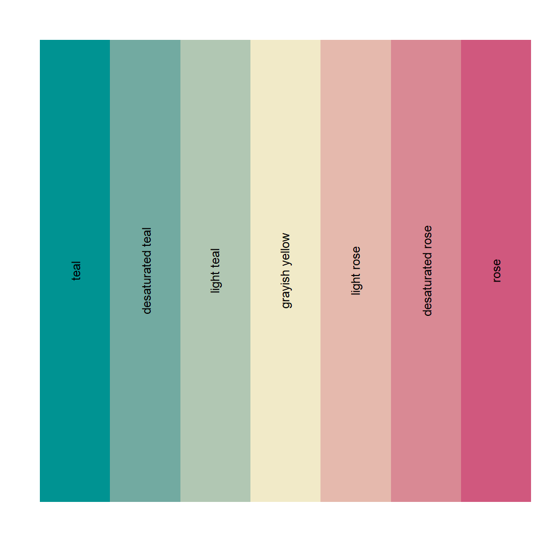
# first generate a color palette
colors <- c('#009392', '#72aaa1', '#b1c7b3', '#f1eac8',
            '#e5b9ad', '#d98994', '#d0587e')
names(colors) <- c('teal', 'desaturated teal', 'light teal', 'grayish yellow',
                   'light rose', 'desaturated rose', 'rose')

# show the palette without labels
show_palette(colors, label = F)

# show the palette with labels, default behavior
show_palette(colors)

# show the names of the color palette
show_palette(colors, use_names = T)
And the images below.


FYI, this palette is from the Carto's data driven color schemes.